How to Show a Radius on Google Maps

A radius map is one of the most useful ways to understand distance and proximity. Whether you’re planning delivery zones, analyzing a service area, or just exploring your current location, a radius map helps you visualize how far things are from a specific spot.
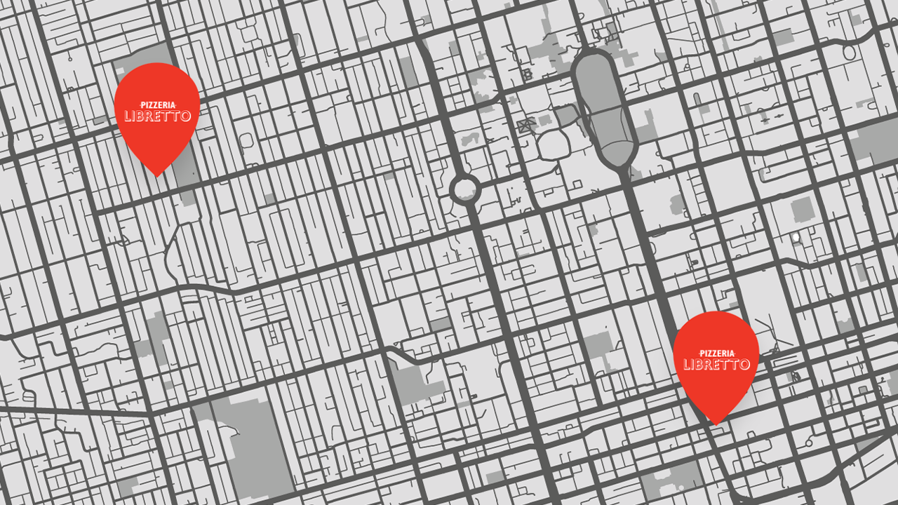
If you’ve ever tried to do this directly in Google Maps, you’ve probably realized it’s not possible. You can drop pins, measure straight lines, and get directions—but you can’t easily draw a radius circle.
Luckily, there are tools that make it simple. In this tutorial, we’ll show you how to create a radius map using two tools:
- Radius Map Tool — Simple tool. No signup required.
- Atlist — A customizable map tool for creating professional, shareable radius maps built on the Google Maps API.
By the end, you’ll know exactly how to draw a radius around any center point and visualize distance with precision.
Why Use a Radius Map?
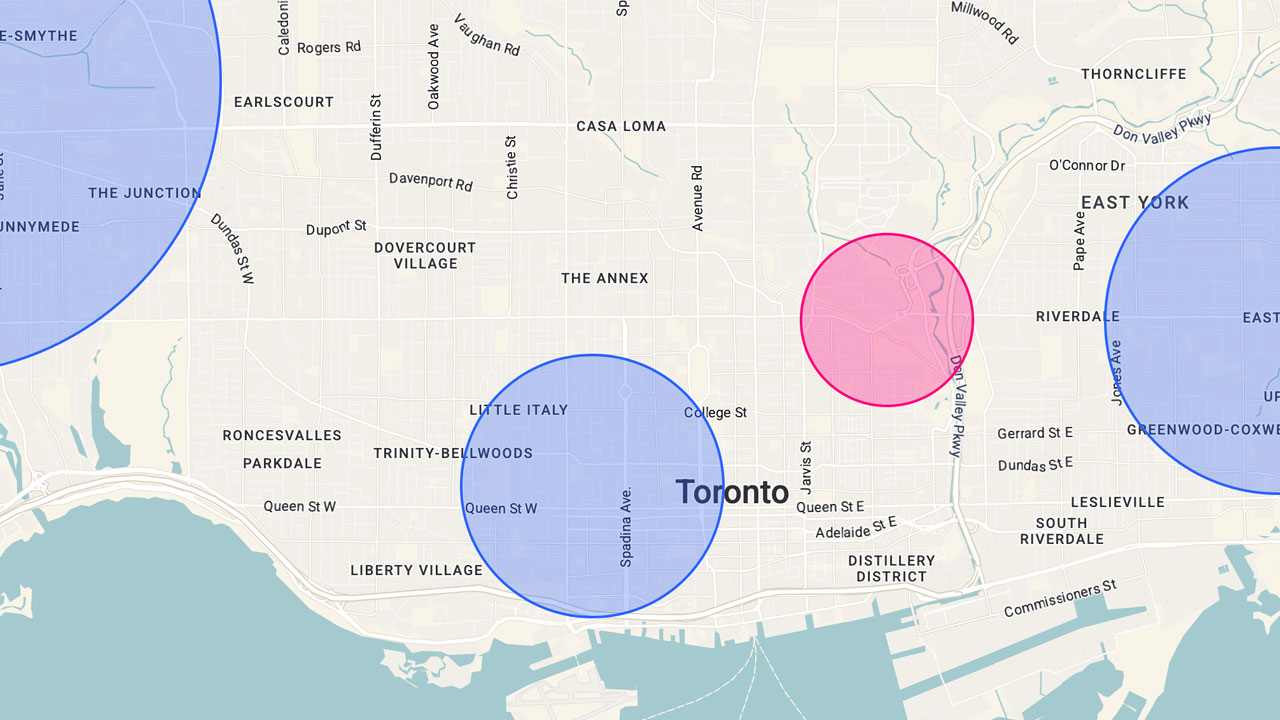
A radius map shows a circular area around a center point, representing a specific distance. You can think of it like drawing a boundary that shows “everything within 5 miles” or “everything within 10 kilometers.”
Businesses use radius maps to define service areas, plan delivery routes, or analyze regional coverage. Travelers use them to estimate travel time from one city to another. And researchers use them to visualize data sets geographically.
No matter your purpose, a radius map helps you optimize decisions that depend on distance.
Tool #1: Radius Map Tool (Free and No Signup)
👉 Try it now → Radius Map Tool
The Radius Map Tool is a simple, free map tool that lets you draw a radius circle instantly—no login or installation required. It’s perfect if you just need a quick radius map without saving or sharing it.
Here’s how it works:
- Go to Radius Map Tool.
- Enter a location, such as your current location or any address. Or draw a circle.
- Choose the distance (for example, 5 miles or 10 kilometers).
- The tool will immediately draw circles showing your radius around that center point.
You can drag the circle to a new place, change the radius size, and zoom in or out for precision.
Because it’s built using the Google Maps API, it’s accurate and familiar—you’ll feel like you’re using standard Google Maps, but with the added ability to draw a radius.
This lightweight radius map tool is perfect for:
- Checking delivery zones and service areas
- Estimating travel time from one location to another
- Exploring nearby neighborhoods or stores
- Comparing distances using the radius calculator

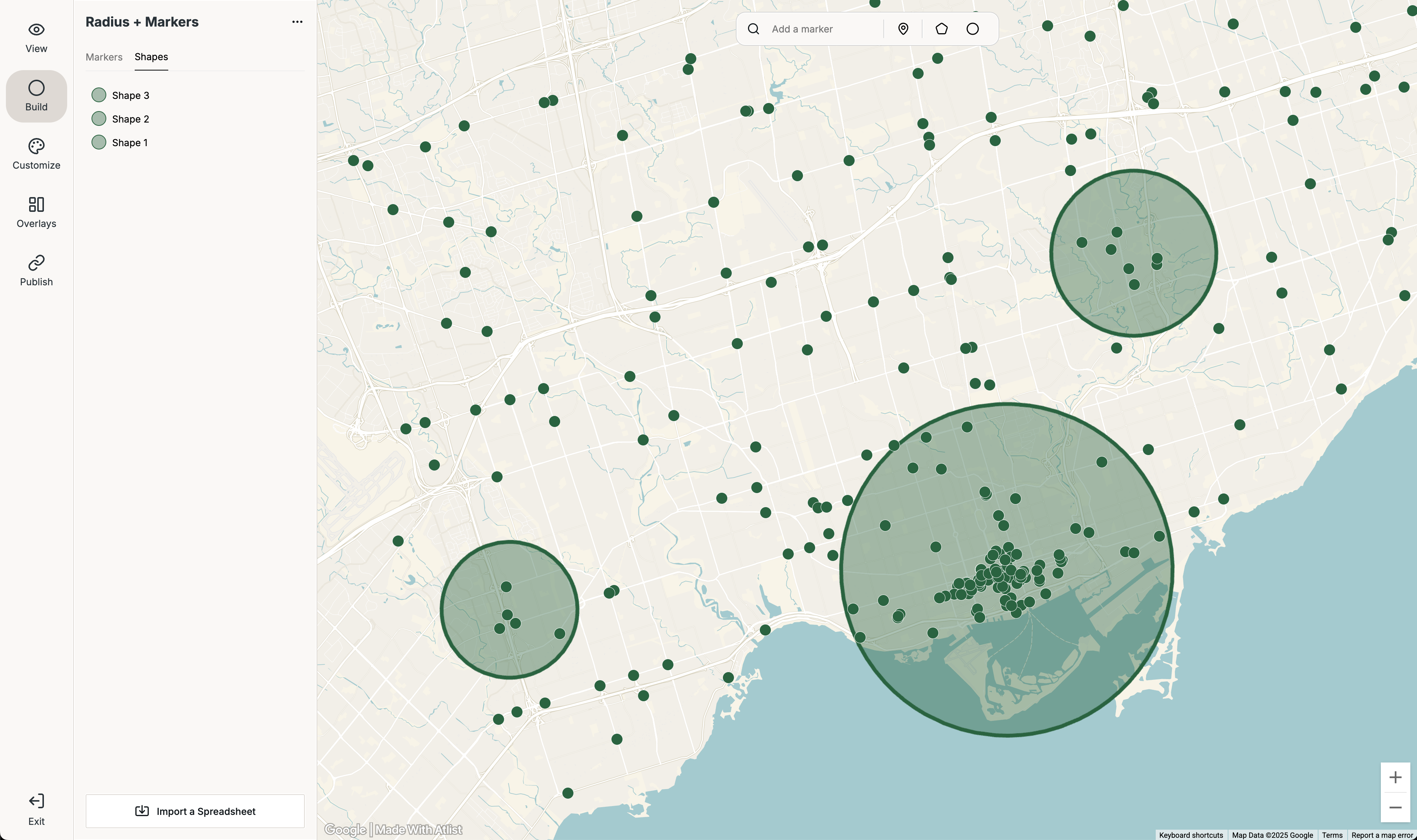
Tool #2: Atlist (Free but Signup Required)
If you want more control and the ability to save, customize, and embed your radius map, try Atlist. It’s a free web-based map tool that uses the Google Maps API to let you design and share interactive maps.
You can create detailed radius maps, add pins, and even import data sets.
How to use Atlist to draw a radius:
- Create a free account at Atlist.com.
- Add a new map and drop your center point.
- Use the Circle feature to draw circles around your chosen point.
- Adjust the radius size (for example, 3 km, 5 miles, or 10 miles).
- Style your map with custom colors, fonts, and icons.
- You can embed or share your map — but you'll need to upgrade to a paid plan.
For more detail, see the documentation on Atlist’s Circle feature: Atlist Circle Help Center.
With Atlist, you can also:
- Combine circles and polygons to define complex zones.
- Overlay multiple data sets for comparison.
- Switch between metric or imperial distance units.
- Save maps for team use or embedding on your website.
Atlist is free to use but charges if you want to embed maps on your website. Still, it’s one of the most complete map tools for professionals who rely on Google Maps visualization.
Understanding Radius Maps, Polygons, and Isochrones
While a radius map measures a simple circle distance, you might also encounter terms like polygons and isochrones.
- Polygons: Used for irregular boundaries such as city borders, postal codes, or neighborhoods. They let you visualize complex shapes instead of perfect circles. This free tool is an easy way to create polygon maps.
- Isochrones: Used to represent areas reachable within a specific travel time (for example, “everything within 15 minutes by car”).
If your goal is to show exact drive-time areas, isochrones are more accurate than a radius circle. But for most use cases—like marketing reach or delivery zones—a radius map is simpler and faster.
Tips to Optimize Your Radius Map
To make your radius map as clear and effective as possible, follow these quick tips:
- Keep your radius size consistent when comparing multiple maps.
- Choose the right metric (miles or kilometers) for your audience.
- Zoom in to verify that your center point aligns perfectly.
- Combine your radius circle with relevant data sets (like store locations or customers).
- Use polygons or isochrones when you need complex shapes or time-based boundaries.
- Simplify and optimize your design by avoiding clutter—too many circles or layers can confuse viewers.
These adjustments help your map look professional and perform well on any device.
Radius Map FAQs
Q: Can I create a radius map in Google Maps directly?
No. Google Maps doesn’t include a built-in radius feature. You’ll need a third-party map tool like Radius Map Tool or Atlist.
Q: What’s the difference between a radius circle and polygons?
A radius circle shows a fixed distance from a center point, while polygons can outline irregular boundaries.
Q: How do I measure travel time instead of straight-line distance?
For that, use isochrones — shapes that represent reachable areas within a specific travel time.
Q: Can I switch between metric and miles?
Yes. Both tools let you select your preferred metric system.
Q: Can I import my own data sets?
Yes. Atlist allows you to import and layer data sets directly on your radius map.
Final Thoughts
Creating a radius map on Google Maps is easy when you have the right map tool.
Use Radius Map Tool if you just want to draw circles quickly around a center point—perfect for simple, one-off projects.
Use Atlist if you want a more advanced radius tool.
Both tools rely on the Google Maps API for accuracy, support metric units, and let you clearly visualize your service area, travel time, and distance boundaries.
So whether you’re planning logistics, defining a delivery zone, or just exploring your current location, a radius map is the simplest, smartest way to see distance at a glance.